Tyr Design System | Tokens, components, docs
A unified design language (Figma × Storybook × Tailwind) that aligned product, website, and marketing while speeding delivery.
Lead Product Designer | 2021 - 2024
Snapshot
What: Cross-product design system: visual language, tokens, accessible components, usage docs, and governance.
Who: Product designers, frontend engineers, marketing designers.
My Role: System architecture, tokens, component specs, accessibility standards, Storybook docs, adoption enablement across squads.
Stack: Figma, Design tokens, Storybook, Tailwind (or CSS utilities), lint rules, contribution guidelines.
Outcomes: Adopted by 3 squads • Fewer UI bugs reached QA • Releases sped up; consistent brand across product and web.
Outcomes
- Adopted by 3 squads across product & web; single source of truth for tokens/components.
- Fewer UI bugs reached QA; reduced rework on visual/UI defects.
- Releases moved faster, with consistent a11y and brand across surfaces.
Problem → Insight
- Problem: Fragmented UI and ad-hoc components led to inconsistent UX, duplicated effort, and avoidable QA defects.
- Insight: A lightweight token-first system + Storybook docs would let designers and FE ship the same intent, cut handoff, and harden a11y by default.
What I did (design + build)
- Defined design tokens (color, type, spacing, radii, motion), mapped to brand + dark mode.
- Specced and reviewed accessible components (forms, nav, tables, empty states, banners), including states and error patterns.
- Built Storybook documentation with props, usage do’s/don’ts, and code examples.
- Set governance: contribution checklist, PR review flow, versioning, and deprecation rules.
- Ran adoption enablement: weekly clinics, migration guides, and pairing with FE on first two product features.
How it works (compact flow)
- Tokens define primitives (brand + semantic).
- Components consume tokens; states and a11y baked in.
- Storybook renders live examples + usage guidelines.
- Release pipeline versions DS and publishes changelog.
- Squads import DS packages; PR bot flags drift or deprecated props.
Selected screens
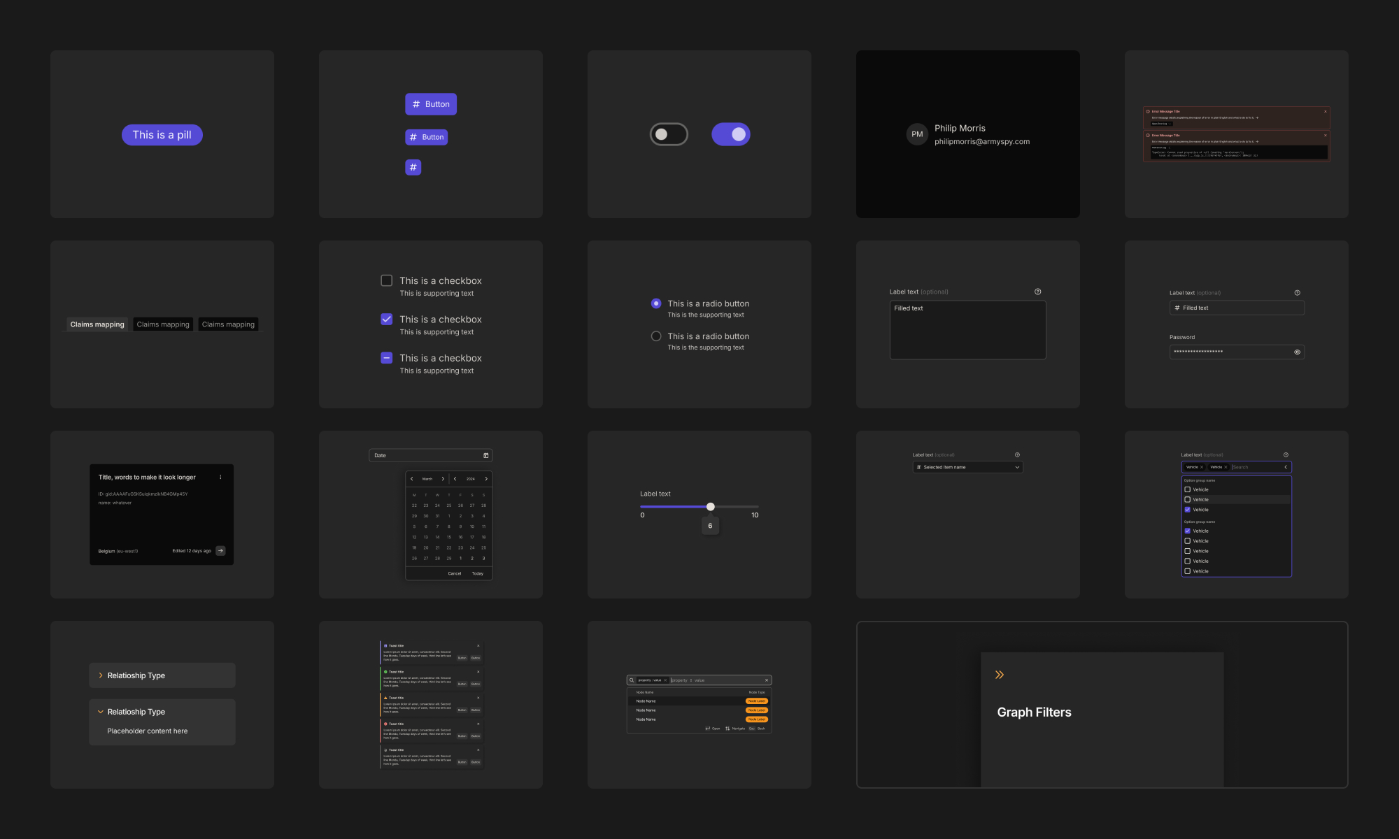
Core component library: 20+ reusable patterns—from inputs and modals to date-pickers—give teams a single source of UI truth.
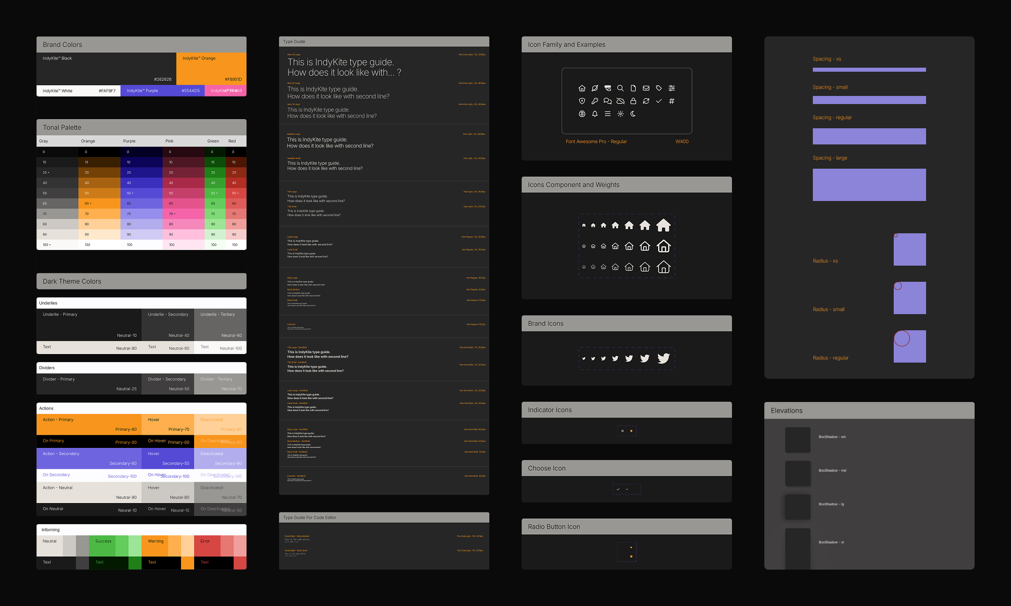
Token ramps: brand → semantic mapping (fg/bg/danger/info) powers theming and consistent contrast by default.
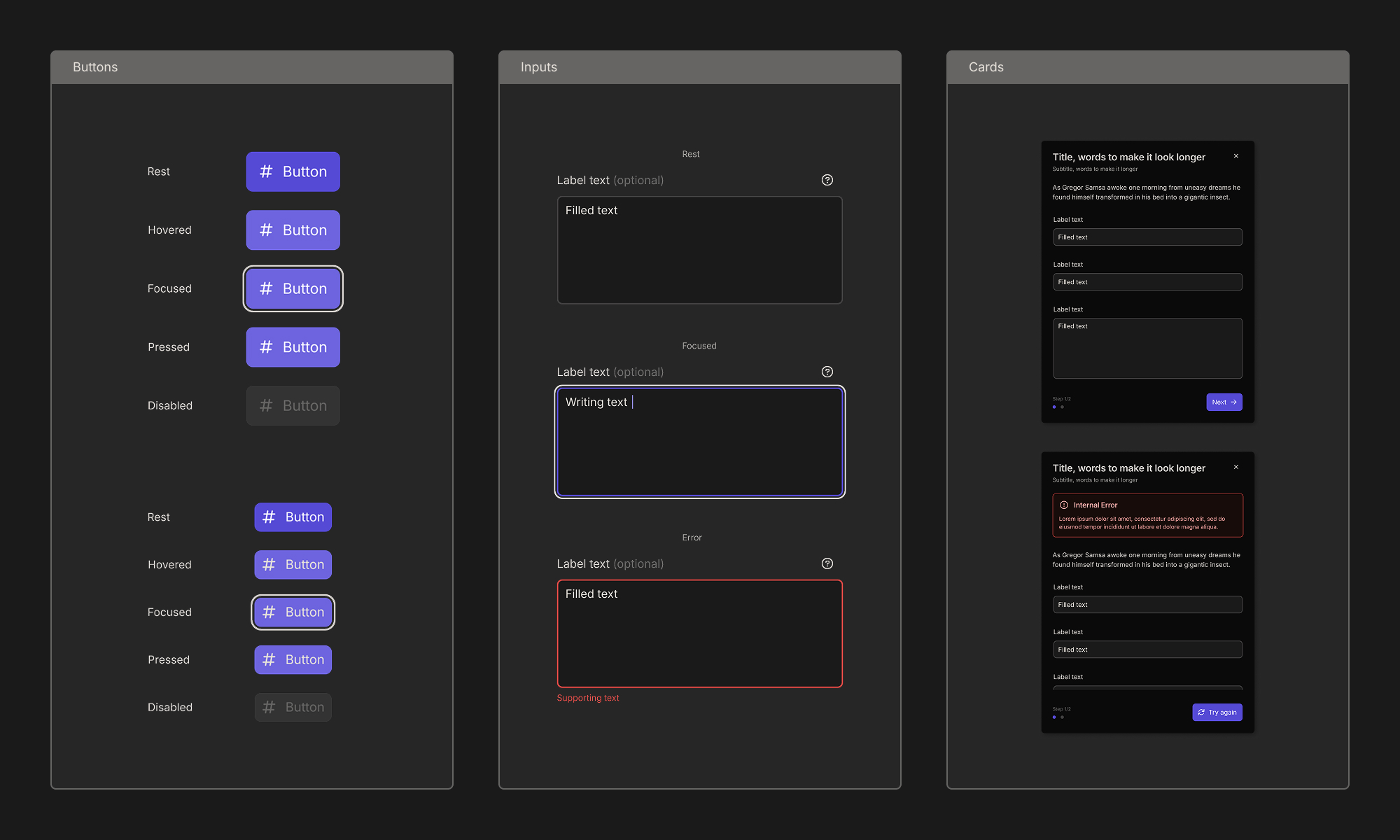
Accessible forms: focus order, helper text, and error states standardised—cutting QA defects on critical flows.
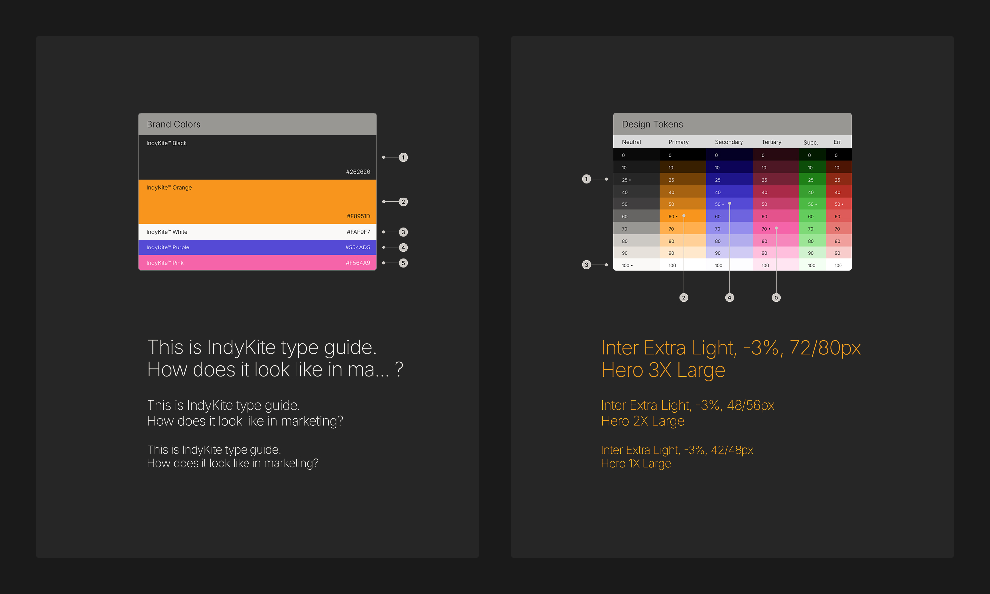
Table kit: density, sorting, and empty/zero/error states documented to eliminate one-off table code.
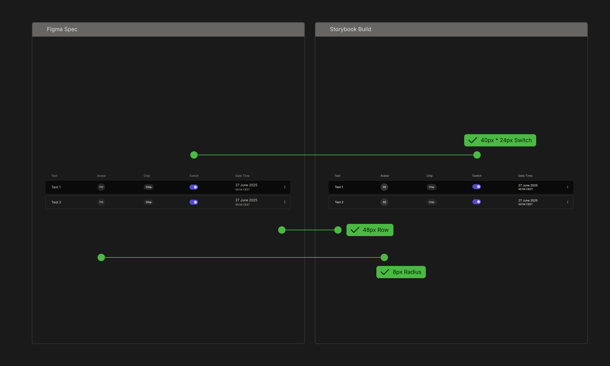
Usage docs in Storybook: props, do/don’t, and code examples reduce handoff and speed new-feature delivery.
Trade-offs & constraints
- Chose semantic tokens over direct brand tokens in code to enable theming; required one extra mapping layer.
- Limited initial scope to bread-and-butter components (forms, table, layout) to land adoption before tackling charts.
What’s next
- Theming for partner deployments (light/dark + high-contrast).
- Data-viz kit (chart primitives) with accessible color palettes and descriptions.
- DS health dashboard: adoption, deprecated usage, a11y score trends.