Tyr Design System: the one-source UI foundation behind every IndyKite product
A scalable Figma × Storybook × Tailwind design language unifying brand, marketing and engineering
Lead Product Designer | 2022 – 2024 (mentored 2 designers, partnered with PMs & FE devs)
Challenge
IndyKite’s UI was fragmented: each product team tuned its own colours, spacing and icon set, making cross-product work slow and visually inconsistent. We needed a single design language that satisfied product, marketing and engineering—without slowing feature velocity. Audit via Figma plugins, Zeroheight reports
Approach
I ran an audit with PMs and FE leads to catalogue 140+ UI patterns, then led workshops aligning brand and product needs. With two designers I mentored, we tokenised colour, type and spacing in Figma Variables, mapped marketing’s palette, and created auto-layout variants for every core component. Storybook became the single source of coded truth, reviewed weekly with devs. Figma Variables, Workshops, Auto-layout variants
Prototype & Tech
Figma → Variants · Auto-layout · Variables Storybook 7 for live MDX demos & Chromatic visual regression React + Tailwind CSS component lib, tokens piped via Style-Dictionary GitHub Actions to publish the DS package and site on every merge Figma → Style-Dictionary → Storybook 7, Chromatic
Key Screens
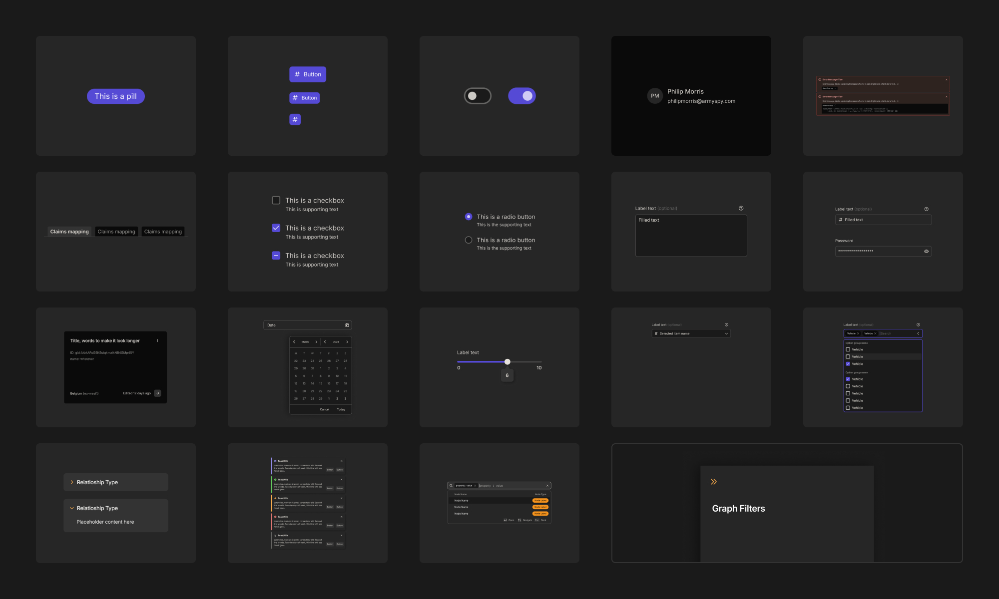
20 core components, one glance. Tyr’s library covers every interaction-from pills to date-pickers giving IndyKite teams a single, reusable source of UI truth.
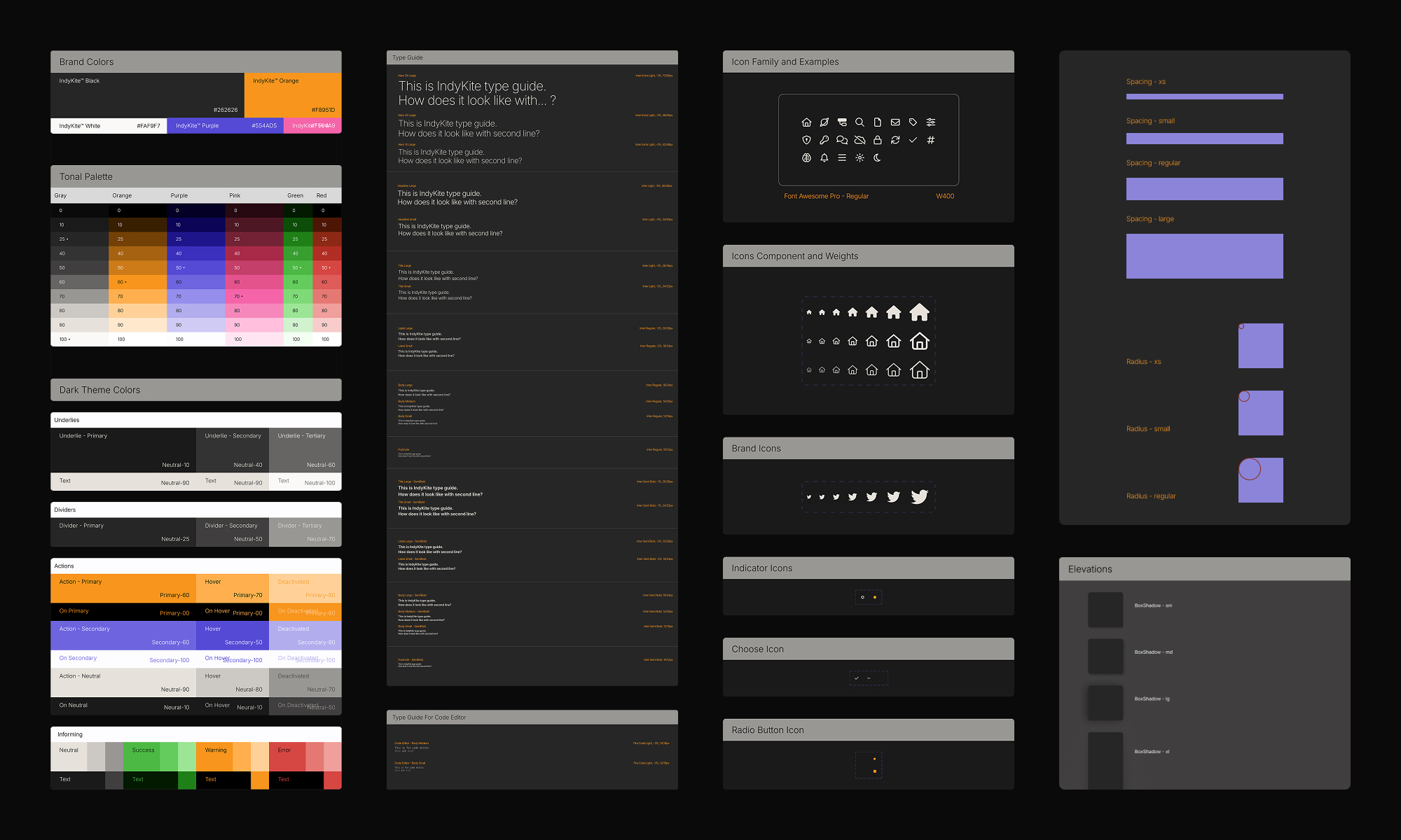
Design DNA in four pillars. Colours, type, icons and spacing tokens, all codified for instant, cross-team consistency.
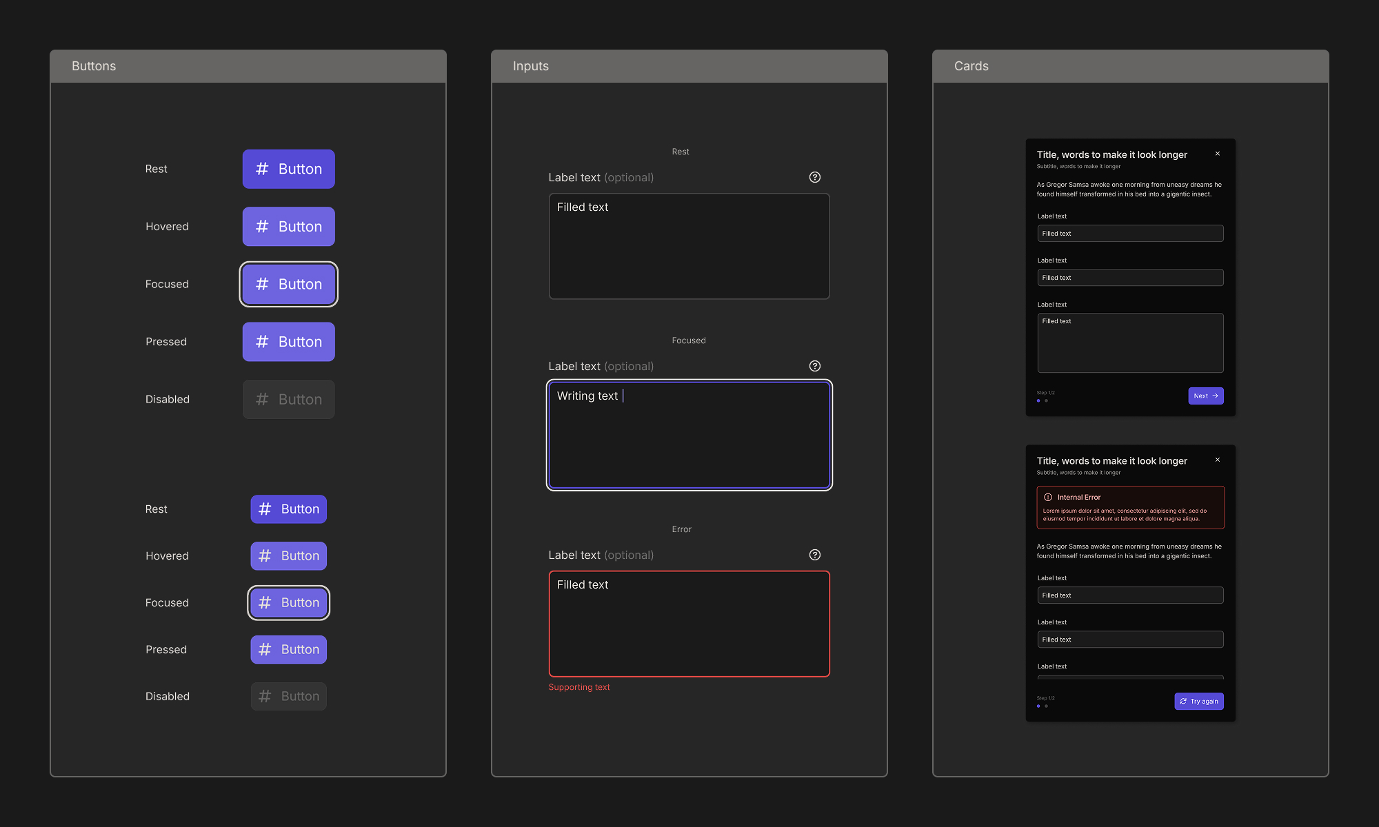
Core components, battle-tested. From primary buttons to complex form cards, Tyr ships every state in Storybook, ready for copy-paste adoption.
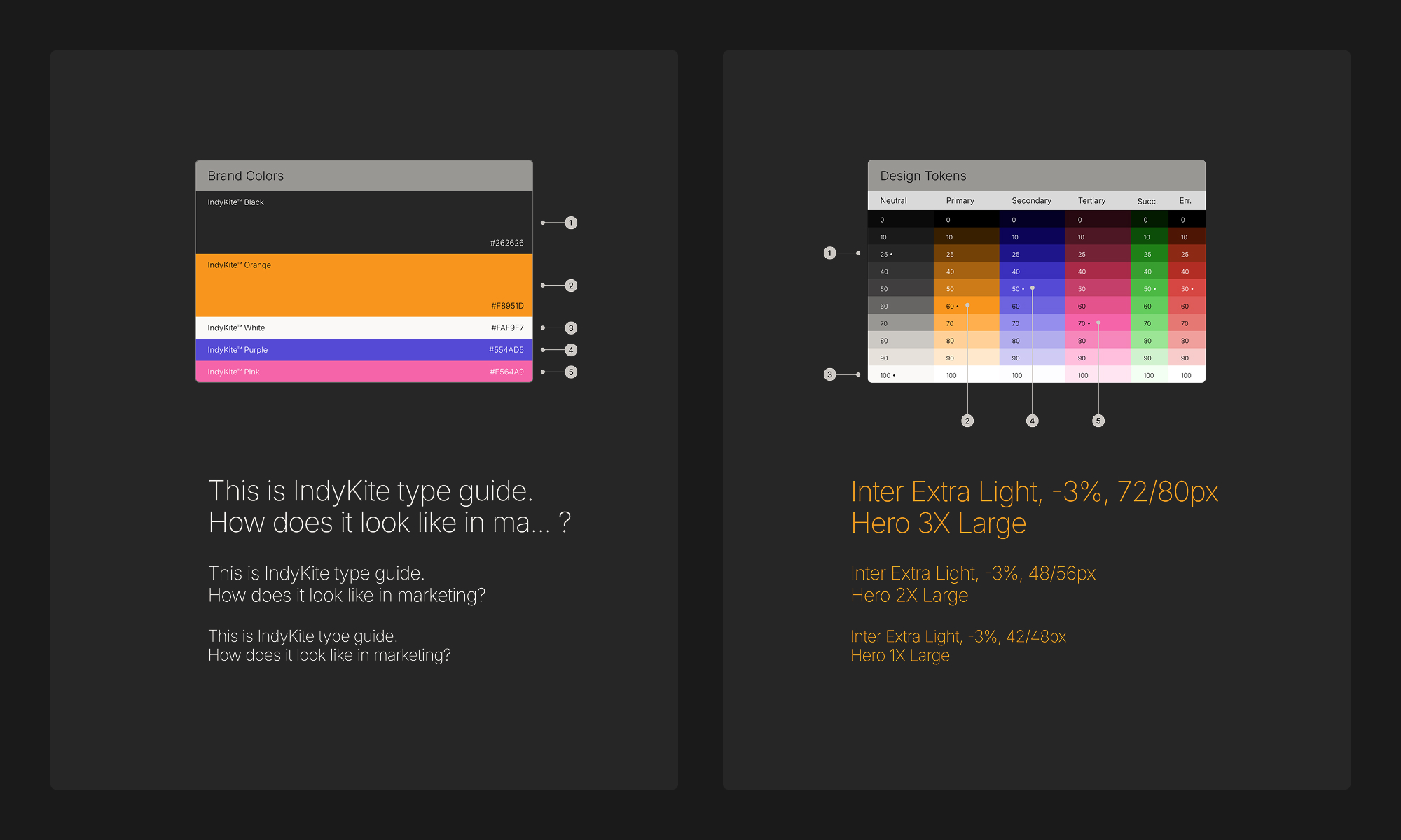
Brand-perfect, token-driven. Marketing’s palette and hero fonts map 1-for-1 to Tyr’s colour and type tokens,guaranteeing every product pixel stays on-brand, automatically.
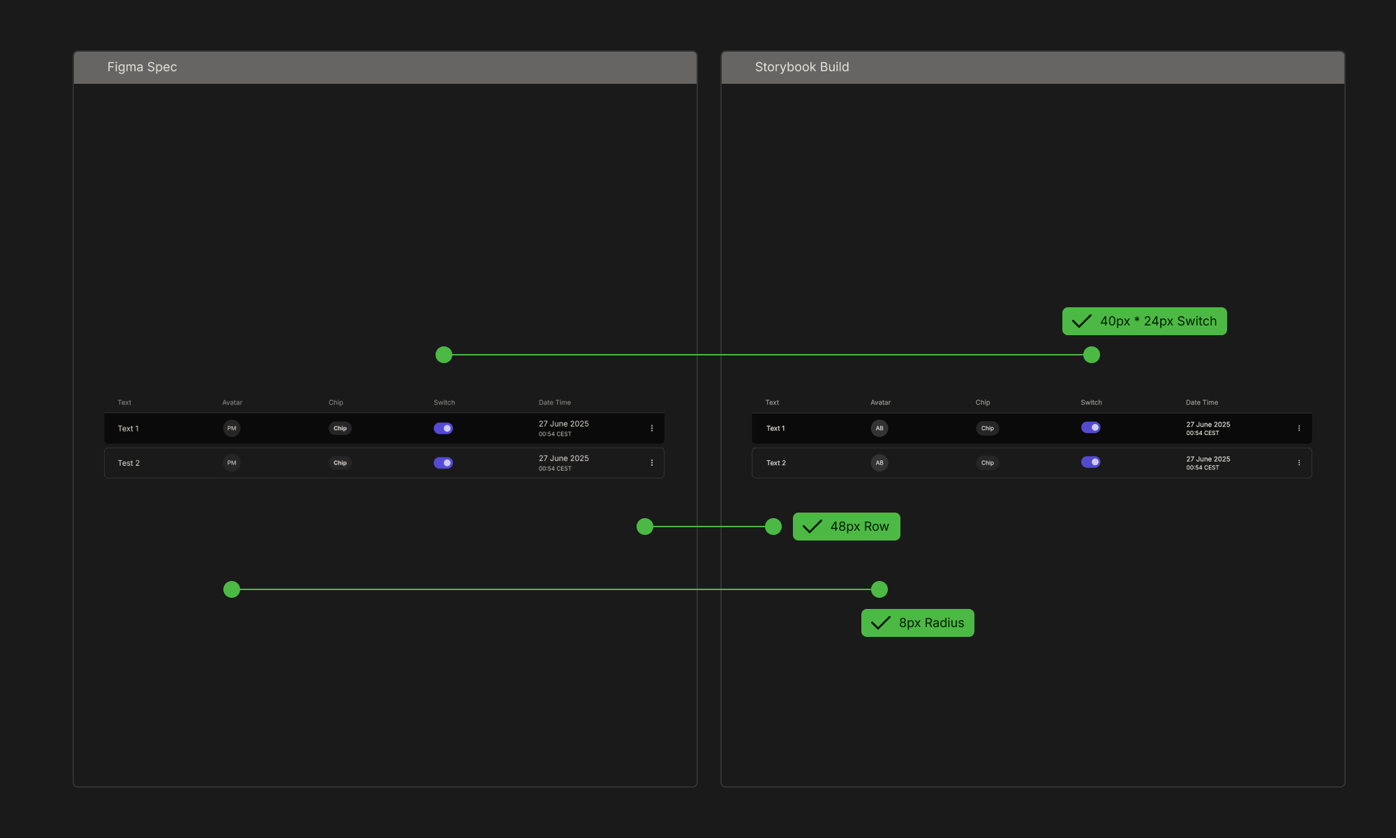
Design = Code, line-for-line. Every data-grid token, avatar size, chip radius, 48 px rows, is verified in Storybook before we ship.
Outcomes & Next Steps
Cut new-feature UI build time 40 % by shipping ready components. Onboarded 3 product teams in < 2 weeks, no custom CSS. Reduced design QA bugs 30 % in first post-launch month. Next: live token syncing to code via Figma API and dark-mode rollout for mobile. GitHub Actions CI, adoption metrics in Datadog